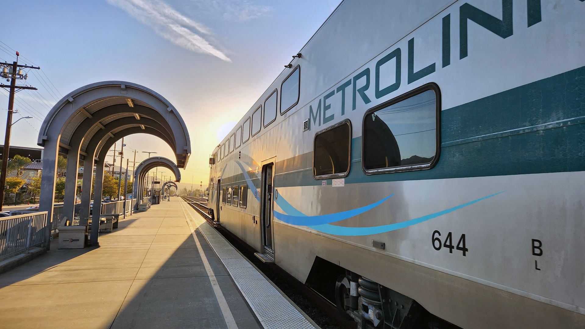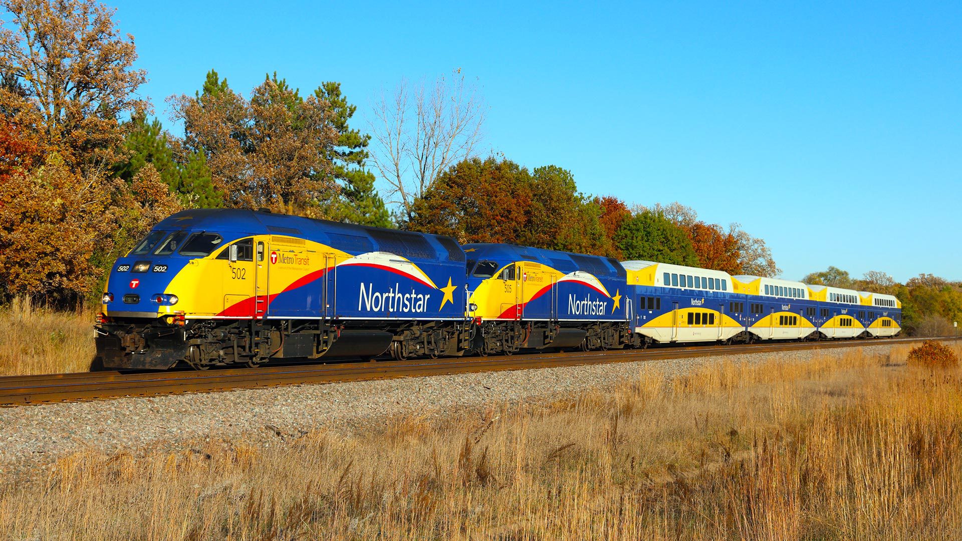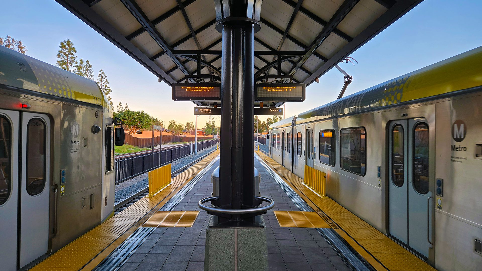

Every major urban rail network in America is growing right now. Not most of them. All ten of them.
That’s the headline buried inside data economist Joey Politano pulled from the Federal Transit Administration’s National Transit Database this week. It’s the kind of number that should probably be bigger news than it is.

The FTA’s NTD collects monthly ridership data from transit agencies across the country, tracking what it calls “unlinked passenger trips,” the standard measure of how many times someone boards a vehicle. Politano compiled January through April 2026 numbers against the same period in 2025, and the trend line is unmistakable: ridership is up across the board among the ten largest urban rail systems in the United States. Check out the entire post on Bluesky.
San Francisco Is Having a Moment
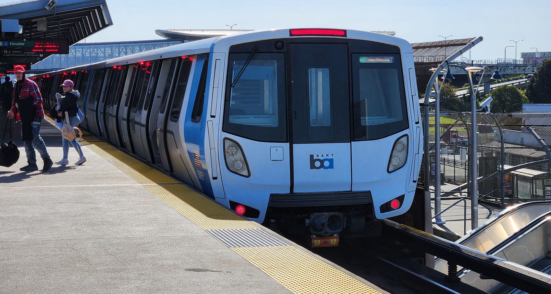
The Bay Area is leading the way, and by a significant margin. Muni posted the highest growth of any system on the list, up more than 17% year over year. BART is right behind it at 15%. Two systems in the same metro, both surging at the same time. That’s not a coincidence. That’s a city coming back to its transit infrastructure.
The Caltrain chart adds important context here. After electrification was completed in late 2024, Caltrain ridership began climbing sharply off a post-pandemic floor. The Bay Area’s transit resurgence isn’t just one agency doing one thing right. It looks more like an ecosystem effect, where multiple systems working together more effectively make each of them more useful.

The Expansion Story
Two of the most compelling charts in Politano’s thread are Seattle and Kansas City, because they tell a specific kind of story: what happens when you actually build more transit.
Seattle’s Link Light Rail has been on an almost uninterrupted climb since opening in 2009, interrupted only by the pandemic collapse and quick recovery that every system went through. The chart is annotated with a series of expansion milestones: University District, Angle Lake, Northgate, the 2-Line opening, Lynnwood, Federal Way, and Redmond. Each corresponds to a visible step-up in ridership. The system is now approaching 45 million annual trips and climbing.

Kansas City’s streetcar tells a similar, smaller-scale version of the same story. After the Main Street extension opened and connected to the UMKC campus, monthly ridership nearly doubled. One expansion, immediate impact.
LA Metro’s chart is the most nuanced in the set. The system peaked at around 110 million annual trips in the mid-2010s, fell hard through the pandemic, and is now rebuilding through a wave of expansion: the K Line, the Regional Connector, the D Line Phase 1 extension (which you already know well as an opening day story in progress), and more projects queued up. The current ridership is running at roughly 70 million annually and trending upward. The network is larger now than it was at the 2015 peak. The riders are catching up to the infrastructure.
Phoenix: The Complicated Case
Valley Metro Rail is the most interesting outlier in the data. Politano’s chart shows the system growing steadily from its 2008 opening to a 2016 peak, then declining even before the pandemic arrived. Post-pandemic recovery has been slower than other cities. The B Line opening in South Phoenix is the most recent milestone, and the monthly annualized numbers are ticking back up, but the trend is choppier than in Seattle or San Francisco.
Phoenix is worth watching precisely because it complicates any simple narrative about transit success. It’s a system in a sprawling, car-oriented metro trying to build ridership through network expansion. The picture is mixed. That’s honest. It’s also an argument for continued investment rather than a reason to stop.

Why This Data Matters
The NTD numbers that Politano is working from aren’t flashy. They’re a federal spreadsheet that gets updated monthly and downloaded by a fairly small audience of analysts, planners, and transit nerds. Most people will never see it.
But the story inside it is straightforward: when cities build transit and run it well, people ride it. When they expand networks with real connections to where people want to go, ridership climbs. When electrification makes service faster and more frequent, ridership bounces back. The variables aren’t mysterious.
Transit ridership in America had a well-documented decade of decline before the pandemic, driven by underfunding, deteriorating service, and the rise of rideshare. The post-pandemic rebound has been uneven. But the 2026 data, at least through April, looks like something different from a rebound. It looks more like a new baseline being established, one in which the systems that invested in their networks are seeing returns.
All ten of the largest urban rail networks in the country are growing. That’s a data point worth pausing on.
A note on the data: The charts in this piece were created by economist Joey Politano using FTA National Transit Database figures. You can find the source data, including the monthly ridership spreadsheet updated through early 2026, at transit.dot.gov/ntd.